Expected Utility Theory is based on four main axioms: completeness, transitivity, continuity, and independence.
The continuity axiom states that if an agent prefers option A to B, and B to C, there exists some probability mixture of A and C that the agent finds equally desirable to B.
The independence axiom asserts that a preference between two lotteries should not be affected by mixing both with an identical third lottery.
These axioms allow for the construction of a cardinal utility function that represents an agent’s preferences over lotteries.
Additional auxiliary axioms often adopted include a reference point of zero wealth, non-satiation, monotonicity, convexity, and diminishing marginal utility.
7.1 Introduction
In my discussion of rationality, I noted that in its most basic form analysis of consumer choice rests on just two assumptions: completeness and transitivity.
For decision-making under risk, we require two additional axioms of desirable behaviour to develop a predictive or descriptive model. These additional axioms are continuity and the independence.
That gives us four axioms:
Completeness
Transitivity
Continuity
Independence
Under these axioms, a decision maker behaves as if choosing between risky prospects by selecting the one with the highest expected utility.
The four axioms are often called the von Neumann–Morgenstern axioms for a rational agent. This gives us another benchmark of “rationality”. An agent is rational if they conform with these four axioms.
One important feature of preferences under these assumptions is that utility is cardinal. The magnitude, not just rank, of the numbers matters.
If you look at other resources on the axioms underlying expected utility theory, you may come across an axiom called the Archimedean property. The Archimedean property is an alternative assumption to continuity. Only one of continuity or the Archimedean property need be assumed. I will not cover the Archimedean property in these notes.
Beyond the axioms of completeness, transitivity, continuity and independence, some additional axioms are often adopted for practical purposes. These include using a reference point of zero wealth, non-satiation, monotonicity, convexity and diminishing marginal utility.
In the following sections, I discuss each of the von Neumann-Morgenstern axioms and the auxiliary axioms we use in examining decision making under risk.
7.2 Continuity
The idea behind continuity is that people have similar preferences for similar bundles. If x is preferred to y, bundles close to x are preferred to bundles close to y. There are no “jumps” in utility.
Continuity guarantees that every preference relation can be represented by a continuous utility function (and vice versa).
Here are two formal definitions.
7.2.1 Definition 1
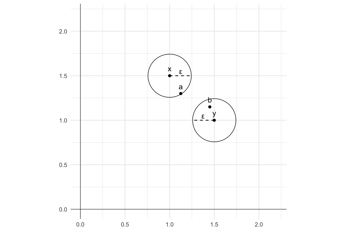
A preference relation is continuous if for any x \succ y there exists a number \epsilon > 0 such that every bundle a that is less distant from x than \epsilon and every bundle b that is less distant from y than \epsilon results in a \succ b.
To put this another way, a preference relation is continuous if for any x \succ y there are some neighbourhoods N_\epsilon x and N_\epsilon y around x and y such that for every a\in N_\epsilon x and b\in N_\epsilon y we have a \succ b.
One way to picture this is to imagine a circle around bundles x and y of radius \epsilon. These circles represent the neighbourhood. There will always exist some circle - even if very small - within which every bundle a within the neighbourhood of x is preferred to bundle b within the neighbourhood of y.
Code
library(ggplot2)# Plot the pointsggplot()+geom_point(aes(x=1, y=1.5)) +geom_text(aes(x=1, y=1.58, label="x")) +geom_point(aes(x=1.5, y=1)) +geom_text(aes(x=1.5, y=1.08, label="y")) +geom_point(aes(x =1, y =1.5), pch=21, size=30) +geom_point(aes(x =1.5, y =1), pch=21, size=30) +geom_point(aes(x=1.125, y=1.3)) +geom_text(aes(x=1.125, y=1.38, label="a")) +geom_point(aes(x=1.45, y=1.15)) +geom_text(aes(x=1.45, y=1.23, label="b")) +# Add a line representing the radius of each circle and label the line epsilongeom_segment(aes(x =1, y =1.5, xend =1.25, yend =1.5), linetype="dashed") +geom_segment(aes(x =1.5, y =1, xend =1.25, yend =1), linetype="dashed") +# Add label epsilon to each circlegeom_text(aes(x=1.125, y=1.55, label="\u03B5")) +geom_text(aes(x=1.375, y=1.05, label="\u03B5")) +# Add vertical and horizontal axis linesgeom_vline(aes(xintercept =0), linewidth=0.25) +geom_hline(aes(yintercept =0), linewidth=0.25) +# Remove x and y axis labelslabs(x ="", y ="") +# Set the limits of the plotcoord_fixed(xlim =c(0,2.2), ylim =c(0,2.2))+# Set the themetheme_minimal()
The intuition behind this definition is that a very small change in your bundle should not result in a sudden switch of your preferences. If you prefer 5 bananas to 2 oranges, you will likely prefer 4.9 bananas to 2 oranges. (And if not, there will be some amount of bananas between 4.9 and 5 that you prefer over 2 oranges.)
Here’s another intuitive example: if you prefer a Mercedes to a Toyota, there will be some level of defect in the Mercedes that you would be willing to accept while still preferring the Mercedes to the Toyota.
7.2.2 Definition 2
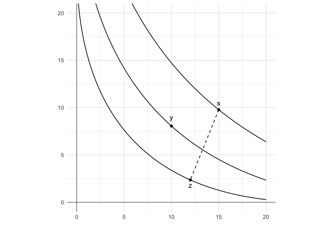
If x, y and z are lotteries with x\succcurlyeq y\succcurlyeq z, the continuity axiom requires that there exists a probability p such that y is equally as good as a mix of x and z. That is, there exists p such that:
px+(1-p)z \sim y
The below diagram illustrates continuity under this definition.
On the diagram are three bundles: x, y and z, and each sits on a different indifference curve. The indifference curve that x is on is higher than that of y which is higher than that of z. That is, x\succcurlyeq y\succcurlyeq z.
Now consider a gamble that pays x with probability p and z with probability 1-p. Each value of p would result in a gamble with utility falling between that of x and z. If we were to draw a line between x and z, you could think of the utility of the gamble for each value of p as having the same utility as a bundle on that line. Under the continuity axiom, there would be no holes in that line. For some value of p, that gamble will be on the same indifference curve for y. At that point, px+(1-p)z \sim y.
Code
library(ggplot2)# Create a data framedf <-data.frame(n =seq(0.05,20,0.05),x=NA,y=NA,z=NA)# Fill columns of the data framedf$x <- (7-df$n^0.5)^2df$y <- (6-df$n^0.5)^2df$z <- (5-df$n^0.5)^2# Plot the line and pointsggplot()+geom_line(data = df, mapping =aes(n, x))+geom_line(data = df, mapping =aes(n, y))+geom_line(data = df, mapping =aes(n, z))+geom_point(aes(x=15, y=(7-15^0.5)^2)) +geom_text(aes(x=15, y=10.5, label="x"))+geom_point(aes(x=10, y=(6-10^0.5)^2)) +geom_text(aes(x=10, y=9, label="y"))+geom_point(aes(x=12, y=(5-12^0.5)^2)) +geom_text(aes(x=12, y=1.8, label="z"))+# Add vertical and horizontal axis linesgeom_vline(xintercept =0, linewidth=0.25)+geom_hline(yintercept =0, linewidth=0.25)+# Add a dashed line segment between two pointsgeom_segment(aes(x =15, y = (7-15^0.5)^2), xend =12, yend = (5-12^0.5)^2, linetype=2)+# Remove the axes labelslabs(x ="", y ="") +# Set the limits of the plotcoord_fixed(xlim =c(0,20), ylim =c(0,20))+# Set the themetheme_minimal()
7.2.3 Example of discontinuous preferences
Lexicographic preferences occur where an agent prefers any amount of a good x to any amount of another good y. If choosing between bundles of goods, the agent will choose the bundle with the most x, regardless of the amount of y. They will only consider the amount of y if the amount of x in two bundles is identical.
Consider an agent with lexicographic preferences who is offered the following combinations of x and y.
A. (1, 1)
B. (1, 2)
C. (1.1, 1)
Their preference ranking will be C\succ B \succ A. They prefer C as it has more x than the other two options. As A and B have the same amount of x, the agent distinguishes them based on the quantity of y, preferring B.
This function is not continuous as there is a “jump” whenever there is an increase in x, even if y is large. Add an infinitesimal amount \epsilon of x to bundle A and the preference relation between bundle A and bundle B flips.
These three bundles A, B and C are represented graphically below.
First, let’s consider these preferences in terms of the first definition, being that there are some neighbourhoods around A and B such that we will always prefer another bundle of goods within the neighbourhood of B to any bundles within the neighbourhood of A. Around A I have drawn a circle of radius \epsilon, which we can consider to be the neighbourhood. No matter how small I draw this circle - that is, no matter how small \epsilon - any bundle within the circle that lies to the right of A (that is, contains x>1) is preferred to bundle B. There is a jump in preferences to the right of A.
Code
library(ggplot2)# Plot the pointsggplot()+geom_point(aes(x=1, y=1)) +geom_text(aes(x=1, y=1.1, label="A")) +geom_point(aes(x=1, y=2)) +geom_text(aes(x=1, y=2.1, label="B")) +geom_point(aes(x=1.1, y=1)) +geom_text(aes(x=1.1, y=1.1, label="C")) +geom_point(aes(x =1, y =1), pch=21, size=7) +# Add vertical and horizontal axis linesgeom_vline(aes(xintercept =0), linewidth=0.25) +geom_hline(aes(yintercept =0), linewidth=0.25) +# Remove x and y axis labelslabs(x ="x", y ="y") +# Set the limits of the plotcoord_fixed(xlim =c(0,2.2), ylim =c(0,2.2))+# Set the themetheme_minimal()
One interesting feature of lexicographic preferences is that you cannot draw indifference curves on this figure. If a bundle differs from another, it must be strictly preferred to the other as no amount of y can make up for any amount of x.
We can also consider lexicographic preferences in terms of the second definition of continuity. There is no p for which:
pA+(1-p)C \sim B
When p=1, B \succ A. For any p<1, pA+(1-p)C \succ B as any non-zero share of C makes the combination of A and C preferred.
7.3 Independence
Consider the following scenarios.
In the first, a person has a choice between an orange and an apple. They state that they strictly prefer the orange.
In the second, they are offered a choice between two gambles. The first gamble is a 50% chance of an orange and a 50% chance of a pear. The second is a 50% chance of an apple and a 50% chance of a pear. They state that they strictly prefer the gamble with a 50% chance of an orange.
Compare the two scenarios. The choice between an apple or an orange from the first scenario is mixed with a 50% probability of a pear in the second.
Under the axiom of independence, a person who prefers the orange in the first will prefer the gamble with the orange in the second. Mixing those two lotteries (a 100% chance of an orange or a 100% chance of an apple) with a third lottery - in this case, a pear - will not change their order of preference.
More generally, under the axiom of independence, a person who mixes two lotteries with a third lottery will maintain the same order of preference when the lotteries are mixed as they had for the two original lotteries when presented independently of the third.
A formal definition states that if:
x and y are lotteries with x\succcurlyeq y and
p is the probability that a third option z is present, then:
pz+(1-p)x\succcurlyeq pz+(1-p)y
The third choice, z does not change the preference ordering. The order of preference for x over y holds. It is independent of the presence of z.
7.3.1 Example of the axiom of independence
Let us put our earlier example into this formal definition.
Suppose x is a 100% probability of an orange and y is a 100% probability of an apple. I strictly prefer an orange to an apple.
Suppose there is now a third possibility z of receiving a pear, which will be present with p=50\% probability.
Under the axiom of independence, if I prefer oranges to apples, I will prefer a gamble with a 1-p=50\% chance of getting an orange and p=50\% chance of receiving a pear to a gamble with a 1-p=50\% chance of getting an apple and a p=50\% chance of receiving a pear.
That is:
\begin{align*}
\text{orange}\succ \text{apple} \Longrightarrow 50\% \text{ chance of orange} + 50\% \text{ chance of pear}\succ \\
50\% \text{ chance of apple}+50\% \text{chance of pear}
\end{align*}
7.3.2 Distinguishing the independence of irrelevant alternatives from the independence axiom
The independence axiom is distinct from the principle of the independence of irrelevant alternatives.
The independence of irrelevant alternatives states that if an agent prefers x to y, the introduction of a third option z should not change the preference order between x and y. For example, if you select fish rather than chicken from a restaurant menu, being told by the waiter that there is a vegetarian option should not lead you to change your selection to chicken.
The independence axiom is specific to lotteries. The logic behind this specificity is that the outcomes of a lottery are never realised together. They can be treated as independent. In my illustration involving apples, oranges and pears, there is no outcome where the agent receives more than a single piece of fruit. They will receive an apple, an orange or a pear. They will not receive a mix of fruit.
This is not the case for goods. Consider the following example with goods drawn from Page (2022). You are again in a restaurant and have a choice between chicken with mashed potato and beef with mashed potato. You choose the chicken. You are then told that the restaurant has run out of mashed potato, and the options are now chicken or beef with peas. Under the axiom of independence, you would not change your choice to beef. However, beef may go better with peas than chicken. There is an interaction between the two, with the options realised together. Due to this interaction, the axiom of independence is less compelling for the case of goods than it is for lotteries.
7.4 Auxiliary axioms for expected utility theory
Beyond completeness, transitivity, continuity and independence, economists often adopt other axioms. These are not required for expected utility theory, but make analysis more practicable.
These include:
Reference point of zero wealth
Non-satiation
Monotonicity
Convexity
Diminishing marginal utility
I provide further detail on these.
7.4.1 Reference point of zero wealth
When people are considering whether to accept or gamble or compare options, they do not decide from a blank slate. They come with an existing set of resources (wealth), and that wealth may affect their decision. A gamble may be more attractive if someone has more or less wealth.
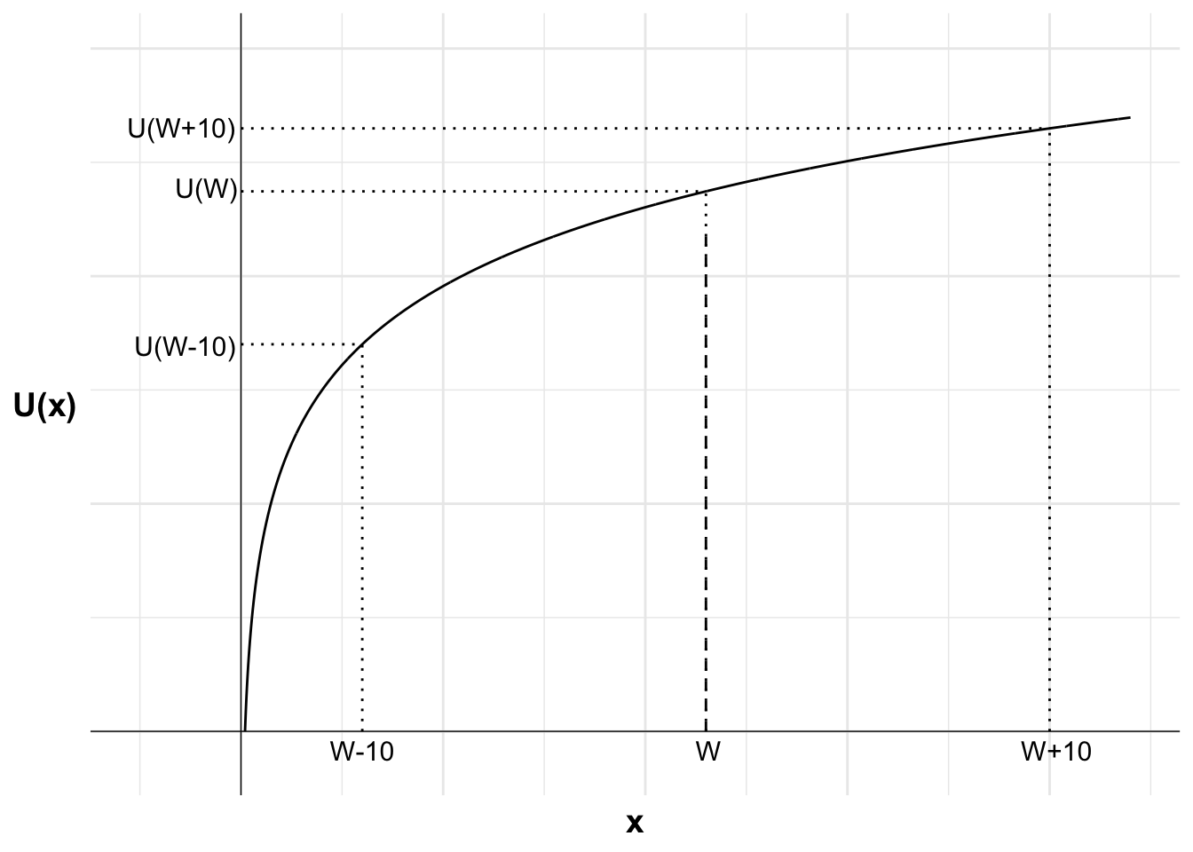
This necessitates the setting of a “reference point” from which utility is calculated. In Expected Utility Theory, that reference point is typically considered to be zero wealth.
The way this is implemented is we typically calculate utility over total wealth. For example, if offered a gamble where they could win or lose $10, we do not calculate the utility of each option as U(\$10) and U(-\$10). Rather, the utility of each option is calculated as U(W+\$10) and U(W-\$10).
Code
library(ggplot2)u <-function(x){log(x)}df <-data.frame(x=seq(1,220,0.1),y=NA)df$y <-u(df$x)#Variables for plot (may not match labels as not done to scale)x1<-30#lossW <-115x2<-200#winpx2<-(W-x1)/(x2-x1)ggplot(mapping =aes(x, y)) +#Plot the utility curvegeom_line(data = df) +geom_vline(xintercept =0, linewidth=0.25)+geom_hline(yintercept =0, linewidth=0.25)+labs(x ="x", y ="U(x)")+# Set the themetheme_minimal()+#remove numbers on each axistheme(axis.text.x =element_blank(),axis.text.y =element_blank(),axis.title=element_text(size=14,face="bold"),axis.title.y =element_text(angle=0, vjust=0.5))+#set limits - need to include room for labelscoord_cartesian(xlim =c(-25, 220), ylim =c(-0.25, 6))+#Add labels W-10, W-10 and line to curve indicating eachannotate("text", x = x1, y =0, label ="W-10", size =4, hjust =0.5, vjust =1.5)+annotate("segment", x = x1, y =0, xend = x1, yend =u(x1), linewidth =0.5, colour ="black", linetype="dotted")+annotate("segment", x =0, y =u(x1), xend = x1, yend =u(x1), linewidth =0.5, colour ="black", linetype="dotted")+annotate("text", x =0, y =u(x1), label ="U(W-10)", size =4, hjust =1.05, vjust =0.6)+#Add line to curve indicating utility of wealthannotate("segment", x = W, y =0, xend = W, yend =u(W), linewidth =0.5, colour ="black", linetype="dotted")+annotate("segment", x =0, y =u(W), xend = W, yend =u(W), linewidth =0.5, colour ="black", linetype="dotted")+annotate("text", x =0, y =u(W), label ="U(W)", size =4, hjust =1.05, vjust =0.3)+#Add labels W+10, U(W+10) and line to curve indicating eachannotate("text", x = x2, y =0, label ="W+10", size =4, hjust =0.4, vjust =1.5)+annotate("segment", x = x2, y =0, xend = x2, yend =u(x2), linewidth =0.5, colour ="black", linetype="dotted")+annotate("segment", x =0, y =u(x2), xend = x2, yend =u(x2), linewidth =0.5, colour ="black", linetype="dotted")+annotate("text", x =0, y =u(x2), label ="U(W+10)", size =4, hjust =1.05, vjust =0.45)+#Add labels W, E[U(X)] and curve indicating eachannotate("text", x = W, y =0, label ="W", size =4, hjust =0.4, vjust =1.5)+annotate("segment", x = W, y =0, xend = W, yend =u(x1)+(u(x2)-u(x1))*px2, linewidth =0.5, colour ="black", linetype="dashed")
The practical impact of this implementation is that people’s choices may differ depending on their wealth. The same gamble may be accepted or rejected at different levels of wealth.
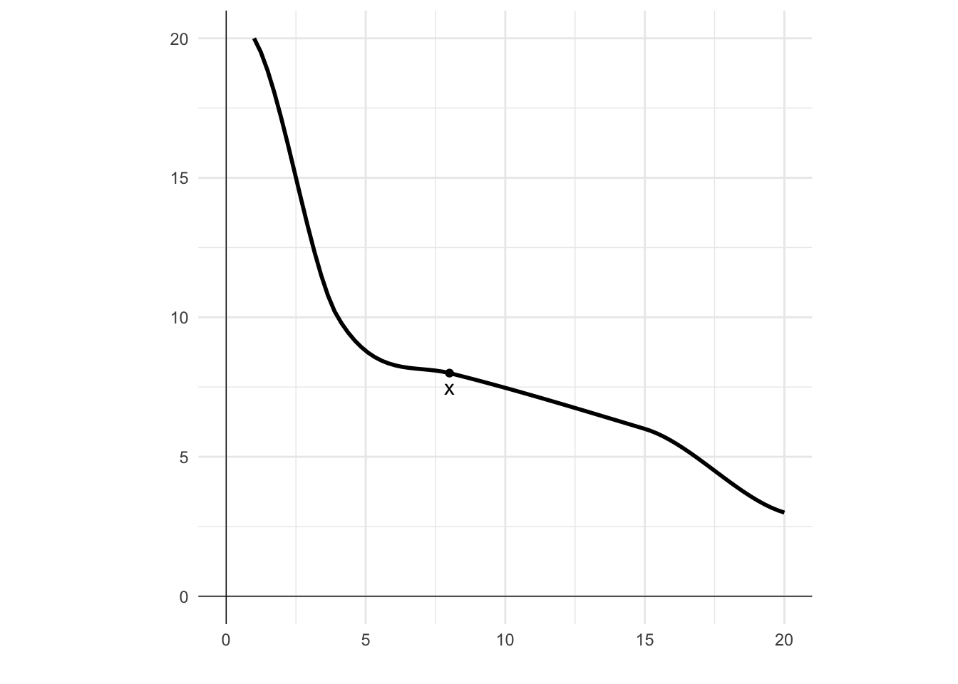
7.4.2 Non-satiation
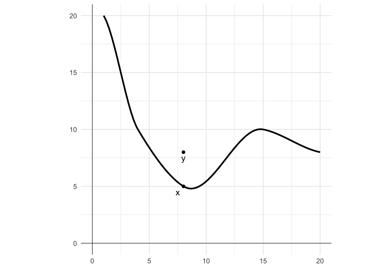
The idea behind non-satiation is that no matter what you have, there is always another (nearby) bundle that you would rather have. There is no “maximum” level of utility that you can achieve. Whatever your utility now, you can always increase it.
In this diagram I have plotted an indifference curve. Point x is on the curve. For non-satiation, there will always be a point, such as y, that is strictly preferred to x.
Code
## Load ggplot2library(ggplot2)## Create a data frame with 2 columns and 4 rowsdf <-data.frame(x =c(1, 4, 8, 15, 20),y =c(20, 10, 5, 10, 8))# Plot a smooth line through the pointsggplot()+geom_smooth(data = df, mapping =aes(x, y), color ="black", na.rm =TRUE)+# Add points and labelsgeom_point(aes(x=8, y=5)) +geom_text(aes(x=7.5, y=4.5, label="x"))+geom_point(aes(x=8, y=8)) +geom_text(aes(x=8, y=7.5, label="y"))+# Add vertical and horizontal axis linesgeom_vline(xintercept =0, linewidth=0.25)+geom_hline(yintercept =0, linewidth=0.25)+# Remove x and y axis labels labs(x ="", y ="")+# Set the limits of the plotcoord_fixed(xlim =c(0,20), ylim =c(0,20))+# Set the themetheme_minimal()
7.4.3 Monotonicity
Preferences are monotone if more of any good in the bundle makes the agent strictly better off. Non-satiation is implied by monotonicity, but not the other way around.
Monotonicity implies downward-sloping indifference curves. This is because any increase of a good in your bundle would take you to a higher indifference curve. A horizontal indifference curve is not feasible as moving along that indifference curve implies more of the good, but that is not possible as monotonicity implies you are better off and hence on a higher indifference curve.
This can be seen in the following diagram. Point x lies on the indifference curve. Increasing the amount of either good will take you to a higher indifference curve. That is true for all points on that indifference curve.
Code
## Load ggplot2library(ggplot2)## Create a data frame with 2 columns and 4 rowsdf <-data.frame(x =c(1, 4, 8, 15, 20),y =c(20, 10, 8, 6, 3))# Plot a smooth line through the pointsggplot()+geom_smooth(data = df, mapping =aes(x, y), color ="black", na.rm =TRUE)+# Add points and labelsgeom_point(aes(x=8, y=8)) +geom_text(aes(x=8, y=7.5, label="x"))+# Add vertical and horizontal axis linesgeom_vline(xintercept =0, linewidth=0.25)+geom_hline(yintercept =0, linewidth=0.25)+# Remove x and y axis labels labs(x ="", y ="")+# Set the limits of the plotcoord_fixed(xlim =c(0,20), ylim =c(0,20))+# Set the themetheme_minimal()
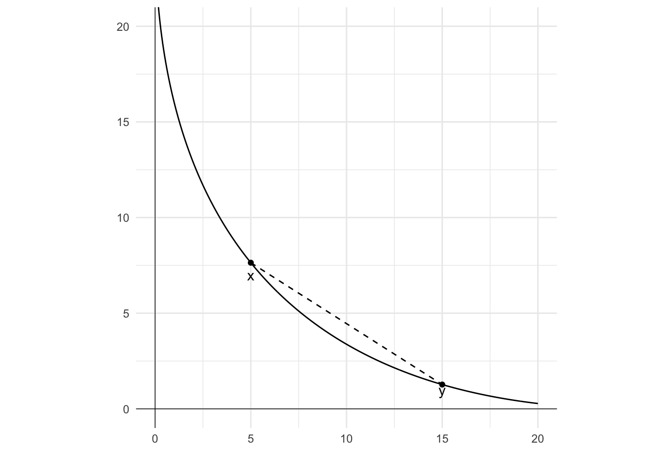
7.4.4 Convexity
Convexity means that people have a preference for variety or combination (indifference curves bulge toward the origin). Averages are better than extremes.
In many contexts this makes sense. For example, suppose you are indifferent between two beers and two meat pies. Under this assumption, any mix of the two, such as a beer and a pie will be at least as preferred as the two beers or two pies.
Formally, a preference relation is convex if, for any x\succcurlyeq y and for every \theta\in[0,1]:
\theta x+(1-\theta)y\succcurlyeq y
This definition is illustrated in the following diagram. The curve represents an indifference curve for different combinations of two goods. There are two bundles, x and y. In this case, x\succcurlyeq y (as x\sim y). Any weighted combination of x and y, which would be on the line between the two, can be seen to be strictly preferred to either x or y as it would be on a higher indifference curve (a curve further from the origin).
Code
library(ggplot2)# Create a data framedf <-data.frame(n =seq(0.05,20,0.05),x=NA)# Fill column x of the data framedf$x <- (5-df$n^0.5)^2# Plot the line and pointsggplot()+geom_line(data = df, mapping =aes(n, x))+geom_point(aes(x=5, y=(5-5^0.5)^2)) +geom_text(aes(x=5, y=7, label="x"))+geom_point(aes(x=15, y=(5-15^0.5)^2)) +geom_text(aes(x=15, y=1, label="y"))+# Add vertical and horizontal axis linesgeom_vline(xintercept =0, linewidth=0.25)+geom_hline(yintercept =0, linewidth=0.25)+# Add a dashed line segment between the two pointsgeom_segment(aes(x =5, y = (5-5^0.5)^2), xend =15, yend = (5-15^0.5)^2, linetype=2)+# Remove x and y axis labelslabs(x ="", y ="") +# Set the limits of the plotcoord_fixed(xlim =c(0,20), ylim =c(0,20))+# Set the themetheme_minimal()
One point to note from this diagram is that if the indifference curve were a straight line, any point on a line between x and y would also be on that line, and weakly preferred to x and y. This would still be a convex curve.
This contrasts with strict convexity. Strict convexity is where, for any x\sim y, x\neq y and for every \theta\in[0,1]:
\theta x+(1-\theta)y\succcurlyeq y
\theta x+(1-\theta)y\succcurlyeq x
For two equivalent goods or bundles, a weighted average of the two bundles is better than each of those bundles.
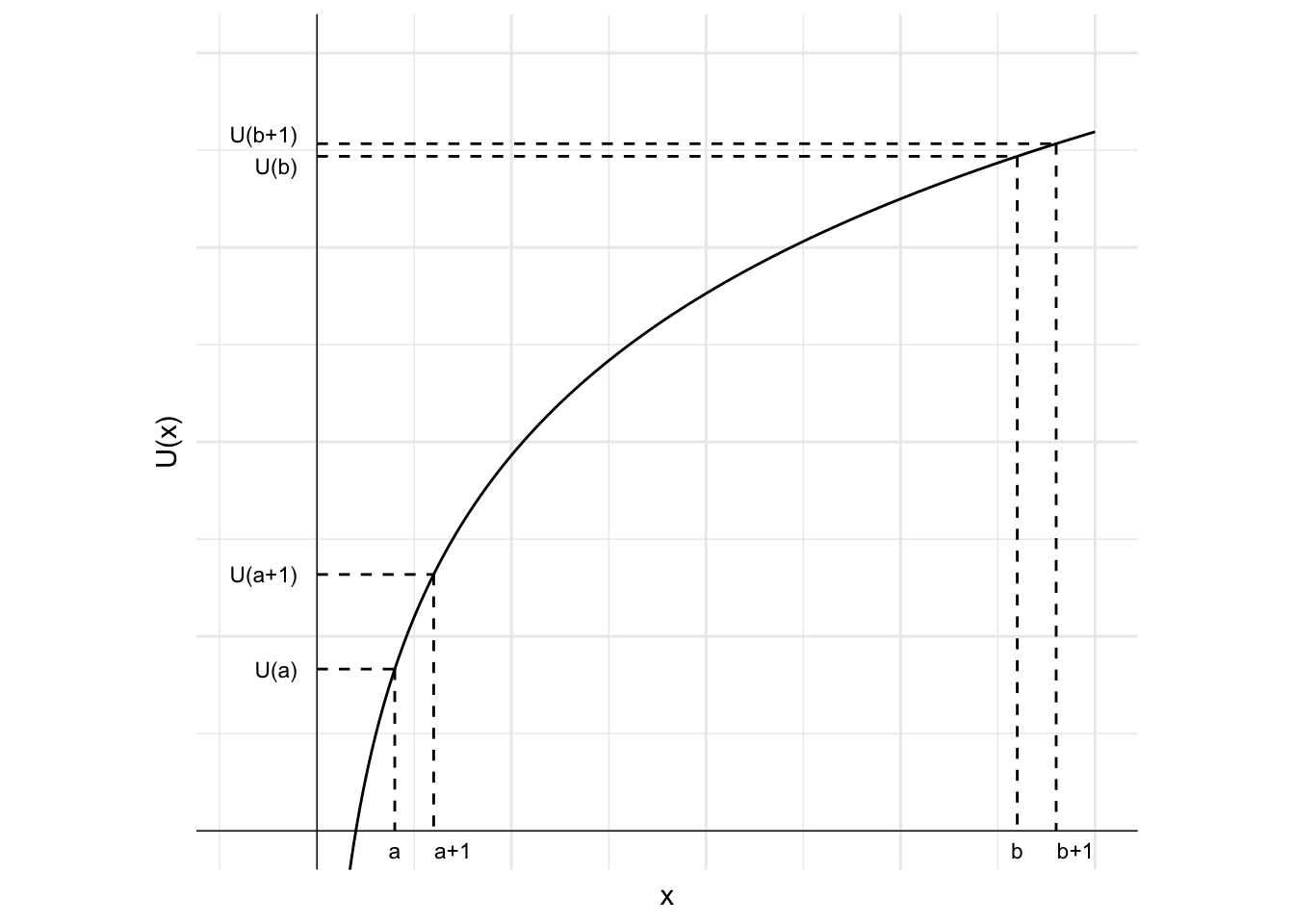
7.4.5 Diminishing marginal utility
Suppose you want some chocolate. You eat a piece. You then eat another. And another. How much utility do you imagine getting from the first piece compared to the 100th piece? The first piece will likely be much more satisfying than the 100th. This is the idea of diminishing marginal utility.
Marginal utility is how much utility you get or lose from an incremental decrease or increase in consumption. Under diminishing marginal utility, each successive additional unit of consumption delivers a smaller (diminishing) amount of utility than the last.
This concept is illustrated in the following diagram. The curve represents an indifference curve for the good x. The curve is concave, which means that the slope of the curve decreases in x and the marginal utility of each additional unit of good x decreases as you consume more of it. One additional unit of good x when the agent has a units of the good leads to a much larger increase in utility than one additional unit when the agent has b units of the good.
Code
library(ggplot2)# Create a data framedf <-data.frame(x =seq(0.05,20,0.05),y=NA)# Fill column x of the data framedf$y <-6*log(df$x)# Plot the lineggplot()+geom_line(data = df, mapping =aes(x, y))+# Add lines showing U(2), U(3), U(18) and U(19)geom_segment(aes(x =2, y =6*log(2), xend =2, yend =0), linetype=2)+geom_segment(aes(x =3, y =6*log(3), xend =3, yend =0), linetype=2)+geom_segment(aes(x =18, y =6*log(18), xend =18, yend =0), linetype=2)+geom_segment(aes(x =19, y =6*log(19), xend =19, yend =0), linetype=2)+# Add labels for 2, 3, 18 and 19 on x-axisgeom_text(aes(x =2, y =-0.5, label="a"), size=3)+geom_text(aes(x =3.5, y =-0.5, label="a+1"), size=3)+geom_text(aes(x =18, y =-0.5, label="b"), size=3)+geom_text(aes(x =19.5, y =-0.5, label="b+1"), size=3)+# Add lines projecting to y-axis from U(2), U(3), U(18) and U(19)geom_segment(aes(x =0, y =6*log(2), xend =2, yend =6*log(2)), linetype=2)+geom_segment(aes(x =0, y =6*log(3), xend =3, yend =6*log(3)), linetype=2)+geom_segment(aes(x =0, y =6*log(18), xend =18, yend =6*log(18)), linetype=2)+geom_segment(aes(x =0, y =6*log(19), xend =19, yend =6*log(19)), linetype=2)+# Add labels for U(2), U(3), U(18) and U(19) on y-axisgeom_text(aes(x =-0.5, y =6*log(2), label="U(a)"), hjust=1, size=3)+geom_text(aes(x =-0.5, y =6*log(3), label="U(a+1)"), hjust=1, size=3)+geom_text(aes(x =-0.5, y =6*log(18)-0.25, label="U(b)"), hjust=1, size=3)+geom_text(aes(x =-0.5, y =6*log(19)+0.25, label="U(b+1)"), hjust=1, size=3)+# Add vertical and horizontal axis linesgeom_vline(xintercept =0, linewidth=0.25)+geom_hline(yintercept =0, linewidth=0.25)+# Add x and y axis labelslabs(x ="x", y ="U(x)") +# Set the limits of the plot while keeping plot squarecoord_fixed(xlim =c(-2,20), ylim =c(0,20))+# Set the themetheme_minimal()+# Remove numbers from axistheme(axis.text.x =element_blank(), axis.text.y =element_blank())
Diminishing marginal utility leads to risk-averse preferences. Someone is risk averse if they strictly prefer the expected value of a gamble to the gamble itself.
Diminishing marginal utility is related to the axiom of convexity. Diminishing marginal utility will lead to convex indifference curves. However, the reverse relationship does not always hold.